


Kellogg’s new identity hits its stride
Kellogg’s £12m marketing behemoth, aimed at celebrating its heritage, has released its latest addition: playing to its mascot’s core identity.
As a shameless fan of Kellogg's recent ‘Cornelius the Cockerel’ reboot by Leo Burnett, it was frankly life-affirming to check in again on the giant cockerel’s continued world domination.
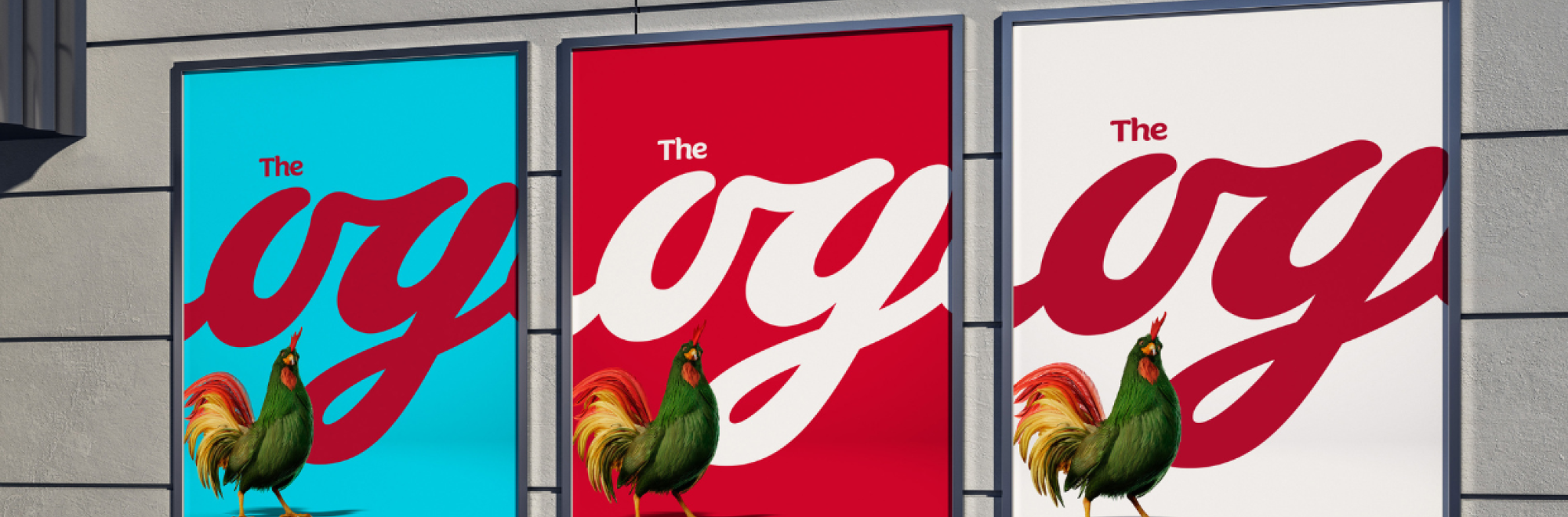
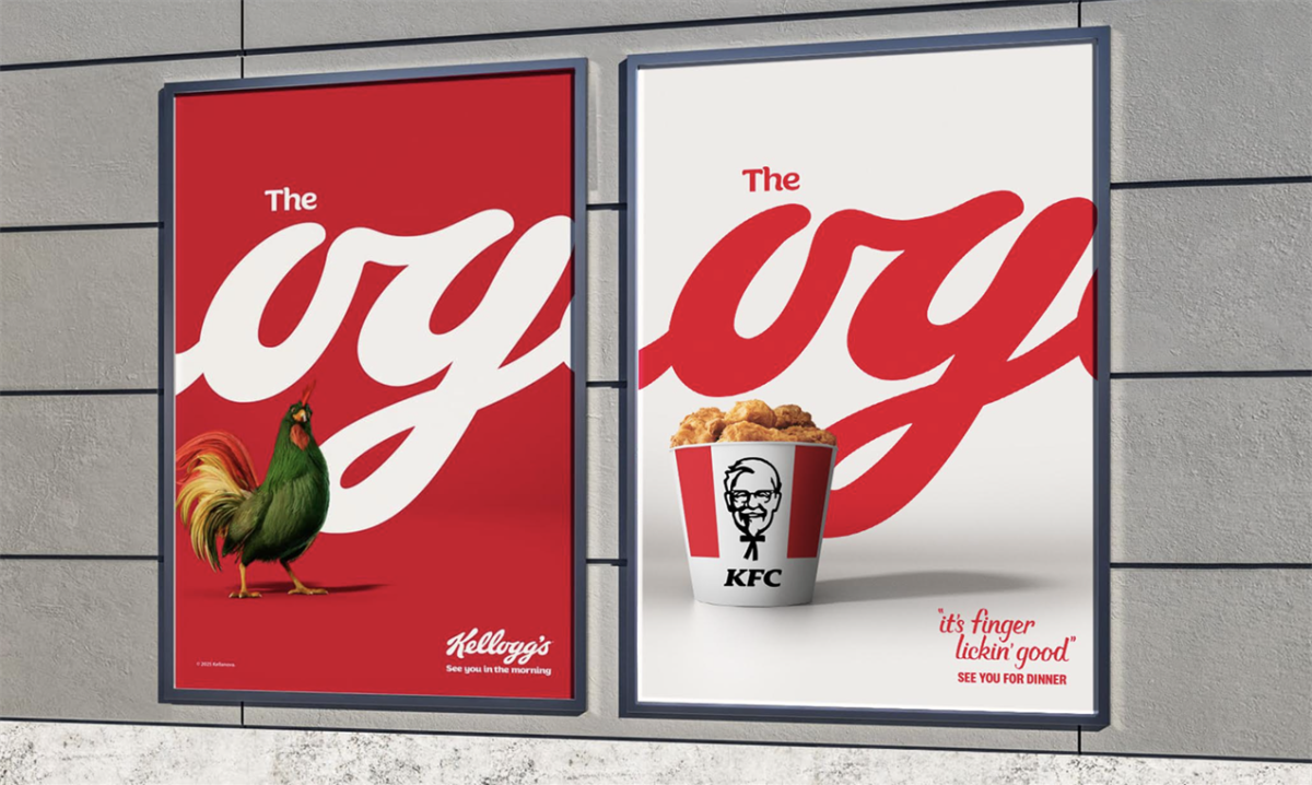
The cereal brand’s latest ad campaign positions him in his rightful spot: namely, the ‘OG’.
‘OG’, for those who aren’t as ‘street’ as me, refers to the phrase ‘original gangster’. The term was coined by LA gang ‘the crips’ and made its way into my rural Surrey lexicon by way of my mate Oz’s parents-be-damned hip hop CD collection.
Anyway, the brand name Kellogg’s, when cropped accordingly, can be shown to display the ‘OG’ moniker. In situ with the new animated mascot, the text forms a simple but effective hook for a bold new campaign.
Don’t cluck with a good format
The ‘OG’ campaign prominently features Cornelius the Cockerel with renewed vigour. Set against Kellogg's signature red, blue, and white colour palette, the campaign showcases the tagline rendered in the classic Kellogg's logo typography.
This design choice pays homage to the brand's longstanding legacy while simultaneously connecting with a new generation of breakfast enthusiasts. The campaign's reach is extensive, encompassing major routes, city centres, and commuter areas across Europe.
In the UK, notable placements include London's ICON at London Bridge, Manchester's ICON Piccadilly East, and The Screen at Printworks Manchester. Dynamic digital out-of-home (DOOH) placements in rail stations nationwide further bring Cornelius to life for busy commuters.
Mark Elwood, chief creative officer at Leo Burnett UK, said the campaign was about distilling Kellogg’s most distinctive assets to “let them sing”. The playful typography and Cornelius’s swagger create a confident, cocky, and fun statement that captures the essence of the brand.
Our take
I praised the original campaign for its incredible animation, upbeat feel and utopian cinematography. The new ads are a fun continuation of this vibe, as the mascot continues to evoke nostalgia while ushering in a new era.
Here’s hoping Kellogg’s leans fully into this new look and feel across its cereal multiverse. A new Tony The Tiger would be on point. A refreshed Coco Monkey might be even better.
Are Ricicles still a thing? Bring back Ricicle Rick regardless. I’m all in on this.
Credits
Ad Agency: Leo Burnett
Campaign Title: See You In The Morning
Client: Kellanova
Advertising Agency: Leo Burnett
CCO: Mark Elwood
Creative Director: Marcus Aitman
Senior Creative: Joe Miller
Design Lead: Miriam Menendez
Motion Design Lead: Carmen Perez Jimenez
Designer: Karolina Alvekrans
Director of Social and Comms Planning: Jen Leung
Planning Partner: Amelia Redding
Senior Planner: Roxy Windisch
Managing Partner: Charlotte Coughlan
Senior Account Director: Tegwen Tucker
Account Manager: Bryan Osango
Account Executive: Sonia Kodasse
Project Director: Laura Wilkin
Agency Producer: Sam Smith
Agency Producer: Lou Pegg
Media Agency: CARAT
Planning Partner: Aaron Fletcher
Comms Planner: Amelia Green
Market Planning Manager: Noemi Alovisi
Market Planning Manager: Michael Chan
Brand Specialists: Landor
Executive Creative Lead: Tristan Macheral
Creative Director: Sarah Bustin
Senior Designer: Seb Hepplewhite
Executive Strategy Lead: Anna Kohl
Strategy Director: Nicholas Moran
Senior Strategist: Louise Dillies
Managing Partner: Kristy Drew
Business Director: Tally Martin
Client Manager: Natasha Alexandrou
Images courtesy of Kellogg's campaign.
If you enjoyed this article, you can subscribe for free to our weekly email alert and receive a regular curation of the best creative campaigns by creatives themselves.
Published on: